How colorful should my blog be? When it turns too gaudy?
We get many blog review requests everyday. In a recent one, the blogger asked us two specific questions and one of them was - 'Is my blog too gaudy and colorful?'
We have dealt with display aspects of blogging in a good number of posts, but have not answered the specific question of when a blog turns too gaudy.
Overall display of a blog, including colors, depends on personal preferences. However, we often do not realize that our own choices of color, font size etc may not be liked by many visitors especially if we use elements that do not suit our type of blog. For example, while a kid blog may look very good if it has doodles, splashes of primary colors, balloons hanging from all corners, a duck floating over the title and weirdly twisted text. But these elements will look totally out of place on a blog on scientific aspects of skin diseases. This could be an extreme example, but doesn't it show that we should not ignore this aspect on the blog?
Coming specifically to 'when does a blog look gaudy', we'd like bloggers to look at these aspects:
We advise that - if your blog is not too experimental and the theme not too extrovert - you should err on the right side: be sober than flamboyant. Use subdued colors rather than bright red, pink, green, yellow and blue. Don't use photos with colors bleeding out of them. Don't use colors just to show off your attitude.
Look at the screen shot of a blog above. This blog claims to be the most boring blog in the world. It is extremely elemental and yet very popular; one of its posts got 392 comments! Can you call such a popular blog 'boring'?
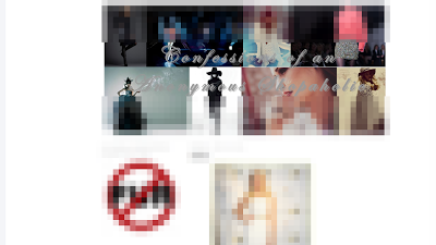
 Now look at the next screen shot of a blog. Its homepage is full of pictures, which is fine, but the title is lost in the collage in the title area. [We have blurred the screen shot but not the title area. Can you read the title?]
The third screen shot is of a site with too many thumbnails on the homepage and each one is supposed to represent a section, but we found the photos too general to serve the purpose. Also notice that the Facebook 'likes' widget has become one among these photos.
Got the point? Let's sum it up:
We have dealt with display aspects of blogging in a good number of posts, but have not answered the specific question of when a blog turns too gaudy.
Overall display of a blog, including colors, depends on personal preferences. However, we often do not realize that our own choices of color, font size etc may not be liked by many visitors especially if we use elements that do not suit our type of blog. For example, while a kid blog may look very good if it has doodles, splashes of primary colors, balloons hanging from all corners, a duck floating over the title and weirdly twisted text. But these elements will look totally out of place on a blog on scientific aspects of skin diseases. This could be an extreme example, but doesn't it show that we should not ignore this aspect on the blog?
Coming specifically to 'when does a blog look gaudy', we'd like bloggers to look at these aspects:
- prominent colors and their arrangements, background patterns and colors
- title and bottom areas
- widget types and coloration
- font type,coloring and size
- images used in posts
- post headings and footers
- suitability of overall display for the blog's theme, age and sex of visitors, target audience's likes and dislikes. This includes cultural icons, taboos, etc.

We advise that - if your blog is not too experimental and the theme not too extrovert - you should err on the right side: be sober than flamboyant. Use subdued colors rather than bright red, pink, green, yellow and blue. Don't use photos with colors bleeding out of them. Don't use colors just to show off your attitude.
Look at the screen shot of a blog above. This blog claims to be the most boring blog in the world. It is extremely elemental and yet very popular; one of its posts got 392 comments! Can you call such a popular blog 'boring'?
 Now look at the next screen shot of a blog. Its homepage is full of pictures, which is fine, but the title is lost in the collage in the title area. [We have blurred the screen shot but not the title area. Can you read the title?]
The third screen shot is of a site with too many thumbnails on the homepage and each one is supposed to represent a section, but we found the photos too general to serve the purpose. Also notice that the Facebook 'likes' widget has become one among these photos.
Got the point? Let's sum it up:
- Don't let display mar navigation.
- Keep the display simple and sober. Add color and vibrancy but just enough.
- Let the blog's overall look suit its subject and visitors' preferences.
You can see our earlier tips on blog design aspects here. You can also see some other tips on photo display on blogs here.

Comments
Post a Comment
We deeply appreciate comments but do not allow comments with links or spam. If your comment is valuable, we publish it and you naturally get a backlink through your profile. Pl do not comment on the same post more than once.