Web design in Hindi blogs: common issues हिंदी ब्लॉग डिज़ाइन में खामियां
updated in September 2020
हिंदी के ब्लॉगों की डायरेक्टरी संकलित करते हुए हमें करीब एक दशक हो चुका है और हम हर वर्ष यह देखते हैं कि हिंदी के ब्लॉगर लिखते तो अच्छा हैं लेकिन अपने ब्लॉगों में रंग या चित्र डालने और अक्षरों की फॉर्मेटिंग पर बिलकुल ध्यान नहीं देते या फिर उन्हें ऐसा कर देते हैं कि केशव की यह कविता याद आने लगती है: केशव केशन अस करी जस अरिहूँ न कराहिं...
इस लेख में हमने कोशिश की है कि हिंदी ब्लॉगों में प्रायः दिखने वाली डिज़ाइन की गलतियों की तरफ आपका ध्यान आकर्षित करें ताकि आप ऐसी गलतियां न करें. यह Web design in Hindi लेख हिंदी और अंग्रेज़ी दोनों में है.
नीचे हमने A से G तक सात चित्र दिए हैं. सब किसी न किसी ब्लॉग के स्क्रीनशॉट हैं और हर चित्र में छोटे चित्रों का समावेश किया गया है, साथ में ज़रूरी टिप्स दिए हैं. बात हमनेब्लॉग्स की की है लेकिन ये टिप्स सभी तरह की हिंदी वेबसाइट के लिए उतने ही काम के हैं.
चित्र A को देखिए. इसके मुख्य भाग में एक ब्लॉग का स्क्रीनशॉट है, जिसमें दर्जनों विजेट (Gadget), बैज या अन्य चीजें लगाई हुई हैं जिनसे ब्लॉग अजायबघर सा लगता है. दाहिनी ओर के छोटे चित्र को देखें: यह एक ब्लॉग का टॉप है, जिसमें बस एक scenery है, और कुछ नहीं.
हमारी राय है कि ब्लॉग को कूड़ेदान न बनाएं। वेबसाइट/ ब्लॉग के टॉप भाग में उसकी मुख्य सामग्री को दर्शाएं या उनके लिंक लगाएं. एक छोटा चित्र, शीर्षक, ब्लॉग का विवरण और मेनू बार यहां बहुत फिट होते हैं.
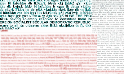
चित्र B को देखिए. यहाँ जो नीला-हरा टेक्स्ट दिख रहा है, वह हिंदी फॉण्ट की गड़बड़ी की वजह से हुआ है. इसके नीचे और दाईं ओर लम्बी 'लेबल लिस्ट' (tag list) हमने ब्लॉगों से कॉपी करके लगाई हैं.
ITB की राय है कि वेबसाइट या ब्लॉग पर हिंदी के केवल यूनिकोड फॉण्ट का प्रयोग करें. हर पोस्ट पर लेबल या टैग ज़रूर लगाएं लेकिन इस तरह कि कुल टैग की संख्या एक दर्ज़न से ज़्यादा न हो. अगर इससे ज़्यादा टैग आप लगा चुके हैं तो टैग की Gadget/ widget पर जा कर उन टैग्स में से केवल सबसे ज़्यादा प्रयोग में हुए कुछ टैग ही वेबसाइट पर प्रदर्शित करने का ऑप्शन चुनें. बहुत ज़्यादा टैग की लिस्ट लगाने से ब्लॉग बचकाना तो लगता ही है, टैग्स लगाने का फायदा ही खत्म हो जाता है.
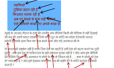
अब चित्र C पर गौर करें. यह भी हिंदी के ब्लॉगों से लिया है. देखिए, किस तरह हम अपने अच्छे-भले ब्लॉग को एक अनपढ़ का ब्लॉग बना देते मात्रा और वर्तनी पर ध्यान नहीं देते. इंग्लिश में हमारी गलतियां तो माफ़ की जा सकती हैं लेकिन अपनी मातृ-भाषा में नहीं.
चलते हैं चित्र D की ओर. इसमें हमने ब्लॉगों से 4 कॉलम/ sidebar के चित्र लगाए हैं. पहला कॉलम इतना पतला है की उसमें जो लेबल, विजेट आदि लगाए हैं, वह पूरे नहीं समाते. दूसरा कॉलम है जिसमें इतना टेक्स्ट दिया हुआ है कि आप ठीक से पढ़ नहीं पाते। तीसरा (पीला) कॉलम पतला है और उसके कुछ विजेट चौड़े हैं जो कॉलम से बाहर आ गए हैं. अंतिम कॉलम एक साइड बार है जिसमें दो वस्तुओं के बीच ज़रुरत से ज़्यादा खाली स्पेस है.
हमारी राय है किवेबसाइट/ ब्लॉग के मुख्य कॉलम और साइडबार की चौड़ाई का ध्यान रखें. अगर टेक्स्ट ज़्यादा हो तो उसे चौड़े कॉलम में ही डालें. साइडबार को न तो बहुत विजेट से भर दें और न उनके बीच में बहुत अधिक जगह छोड़ें. अगर कोई विजेट (Gadget) या पिक्चर आप किसी कॉलम में लगाना चाहें और वह कॉलम से ज़्यादा चौड़ा हो तो विजेट/ पिक्चर की सेटिंग पर जाकर उसे कम चौड़ा कर लें.
चित्र E पर नज़र डालिये. इसमें हमने 3 ब्लॉगों के स्क्रीनशॉट डाले हैं. ऊपर बाईं ओर एक पॉपअप है जो उस ब्लॉग को पूरी तरह से ढक देता है. उसके नीचे एक ब्लॉग का स्क्रीनशॉट है जिसमें ब्लॉगर ने मैगज़ीन में छपे अपने लेख का स्कैन डाला है लेकिन कोई उसे पढ़ नहीं सकता. दाईं ओर नीले के ऊपर गहरे नीले में कुछ लिखा हुआ है जिसे पढ़ने में मशक्कत करनी पड़ती है.
ब्लॉग लोगों द्वारा पढ़े जाने के लिए है. इसलिए ध्यान रहे कि जो पठन सामग्री आप उसमें डाल रहे हैं वह पढ़ी जा सके. धुंधले या गलत फोकस किये हुए स्कैन और रंगों का गलत चुनाव पढ़ने में बाधा डालते हैं, सो इनसे बचिए. साथ ही, ऐसे पॉपअप या विज्ञापन न डालें जो पढ़ने में परेशानी पैदा करते हैं.
चलते हैं चित्र F की ओर. इसमें हमने यह दिखाने की कोशिश की है कि मिलते जुलते रंगों के बैकग्राउंड और टेक्स्ट हों तो पढ़ने में कठिनाई होती है. यह कोई ऐसा ज्ञान नहीं है जो सबको मालूम न हो, लेकिन फिर भी ऐसे बे-मेल रंगों के खेल हिंदी ब्लॉगों में बहुधा दिख जाते हैं.
अंत में चित्र G पर नज़र डालें. इसमें भी अटपटे रंगों के प्रयोग के दो उदाहरण हैं. स्पष्ट है कि रंगों का गलत प्रयोग पठनीयता कम कर देता है और पाठक के मन में खीझ पैदा कर सकता है. इस चित्र में एक स्क्रीनशॉट warning का भी है. अगर पाठक ऎसी वार्निंग देखे तो इस बात की संभावना है की वह तुरंत आपके ब्लॉग को बंद कर देगा. ऐसी warning ज़्यादातर ऐसा कोड या विजेट लगाने की वजह से आती हैं जिनमें कोई नुकसानदेह (malicious) कोडिंग होती है.
हम तो यही राय देंगे कि रंगों का प्रयोग ऐसा न करें जिससे पढ़ने में परेशानी होती है, क्योंकि ब्लॉग पाठक के लिए है, ब्लॉगर के अपने लिए नहीं. बात रही, warning की, अगर इससे बचना है तो ब्लॉग पर ऐसा कुछ न करें जिससे उसमें गलत code घुस जाए. ऐसे ब्लॉग या वेबसाइट के लिंक भी न डालें जिनकी विश्वसनीयता संदिग्ध हो.
कुछ अन्य ऐसे प्रयोग जो हिंदी ब्लॉगों में देखने को मिलते हैं और ब्लॉग की सुंदरता या पठनीयता को कम करते हैं:
- बहुत बड़े या छोटे चित्र लगाना, या एक ही पोस्ट पर कई साइज़ और आकार के चित्र लगाना।
- बहुत बड़े या छोटे साइज़ का टेक्स्ट लिखना.
- टेक्स्ट को कई रंगों में लिखना.
- शीर्षक के चित्र (title image) के अंदर विचित्र लिखावट.
ITB में हिंदी में सभी टिप्स और जानकारी के लिए इधर क्लिक करें: Blogging tips Hindi me
Web designing in Hindi - common issues
Compilation of Hindi blog directory has its thrills and travails. We have talked about the positives of the Hindi logging scene earlier; in the present post, we'd share some very common web design problems we found on Hindi blogs.
We feel bad when we find that many Hindi bloggers ignore some very elementary web design aspects and it makes their blogs shabby, unprofessional, kiddish, unreadable... sometimes even ugly and irritating.
Let us show some common web design and readability issues by real examples. We have, however, masked the blogs' identity by smudging, blurring or shading some parts. We have also given links to ITB posts on related aspects.
A. The first image has screenshots of two blogs. The main shot shows a large number of elements all around, with hardly much real content. The inset is a blog in which the opening screen has a huge photo, and the link to the main blog is hidden at the bottom - and this is not a photoblog.
 |
| A |
For advice on these matters, you can visit this ITB resource: Why simple web design is much better than a cluttered one: best websites are clean and simple
B. In the image below, the top screenshot is a post supposed to be in Hindi but when it was posted by the blogger on the blog in native font, it became unreadable. The lower [red] text is a part of the huge label list at the bottom of a blog. The text [blue] in the right column is a portion of a massive label list in a sidebar.
 |
| B |
ITB detailed tips on how to effectively use labels/ tags/ categories: use labels effectively
C. Have a look at the screenshots of text as it appears on two blogs. These shots show spelling errors or matra issues, indicated with arrows.
 |
| C |
ITB's view: Before you push the 'publish' button for a post, have a final look at grammar, punctuation [especially the usage of ending marks and indentation] and matras [especially कि/ की and bindu as in है/ हैं ].
 |
| D |
ITB's view: We have seen very long and thin sidebars in a large number of Hindi blogs, including those listed in the Directory of Best Hindi Blogs. Sometimes the sidebar hangs down much beyond the main content. We advise that you keep a decent width to the sidebar(s) and keep only those widgets in the sidebar that add value to your blog.
Do not over-stuff the sidebar(s) with text and long lists. Many bloggers stuff long text and long lists, blogrolls, badges etc in the sidebar, which makes the blog look unkempt and childish. Widgets that do not open or go beyond the sidebar also spoil the looks. Blog's bottom is not a sink or dustbin; it should be kept neat and clean, and it should be used purposefully.
ITB reference on good use of widgets/ gadgets: using widgets with impact
 |
| E |
ITB's view: Pop-ups are OK if they serve a purpose, for example, asking the visitor for some action that will help him in some ways. Even then, pop-ups should not be too big and should go away if the visitor does not take any action in 5 seconds or so.
Use scanned images for text only when it is unavoidable. Otherwise, it often becomes unreadable.
 |
| F |
ITB's view: Text is there to be read, so do not ignore text color in relation to the color of the background. Avoid experimenting too much with text coloration. [More on this after image 'G'.]
 |
| G |
Have a look at the Chrome warning. Your visitors are likely to get such warnings if you put on your blog links and widgets that have malicious code. A visitor getting such an alert will not like to visit your blog again.
ITB's view: Let us repeat that being playful with colors is OK, but we should not take too much liberty with TEXT colors. Whether in text or otherwise, avoid using garish colors, especially the primary colors - red, green, yellow and blue. In blogs and websites that have a large amount of text content, one should use a sober color scheme in which text is properly readable.
Text should also not attract attention to its looks such as curious font, variations in text size, and too bright and gaudy colors.
We have a detailed post telling us how much is too much when using colors on blogs/ websites: when a blog is too gaudy.
Well, we have talked recently about the risk of putting malicious code on the blog. This is not a design issue but we put it here to illustrate that you must apply widgets and third-party code on your website/ blog with care.
Other annoying issues we found on Hindi blogs:
- Use of too small or too big text.
- Too big footers after each post, giving details of other blogs of the same blogger etc.
- Use of photos of sizes that are too smaller or bigger than the width of the column in which they are put.
- Childish use of text inside title images.